 Dealer Dan, pictured here with WWE Superstar Mick Foley, has been in internet marketing since 1996. He likes hugs, long walks on the beach, and making money while wearing his jammy jams. For more information, you can read all


While I certainly enjoy spending time auditing websites, both publicly and privately, it can really take up a lot of my time. My article on auditing an Indian Lottery website for example – that was just a small portion of what I covered in the full audit.
It’s not something I like to do often. I’m a big fan of lists, and often when someone attempts to hire me to audit or consult on their website, I suggest I give their website a look over, and provide them with a “Top 10 Things I Would Improve” list instead.
It’s easier for me, and also easier for the webmaster. So today I thought I would share one of those “Top 10” lists, with the permission of Gambling Baba, a catch-all gambling website focused towards the India gambler markets.
I should note these can come off as critical etc. That’s the point! My entire job here is to point out what a webmaster is doing wrong, and where they can improve. I never sugar-coat it.
#1: Ditch The Instant Pop-Up
As soon as I visited the homepage, I was greeted with this pop-up:
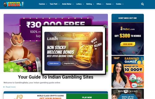
I hate this. I’ve literally just visited the website and you’re practically yelling at me to leave. To make it worse, everything behind the pop-up is more banners! It just seriously hurts the value of the website, as it’s trying to force me to leave before I’ve even had a chance to take a breath.
Pop-ups are fine, but I feel it is better to utilize them later on after the visitor has had time to be on the site. 10-20 second window, non-intrusive and informational. They will be more likely to pay attention to it that way.
#2: More Informational Content Above the Fold:
Again this is in regard to the homepage but look at everything above the fold:
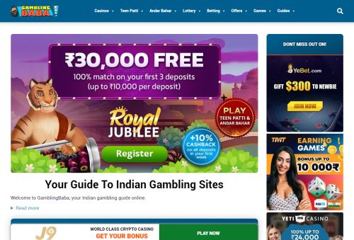
So many ads! Discounting that pop-up, that’s 5 different ads for 5 different casinos. That’s crazy.
Less is more. I remember consulting for a popular site focused on MMA many years ago. Big fanbase, kept trying to promote various different sportsbooks to no success. I think they were making about $300-$400 a month with a handful of signups.
I analyzed their audience and told them their audience has a big trust in them – so go with one sportsbook and promote it like it’s the be-all and end-all and that no other sportsbook matters. That it will take time, but the audience trusts them and will soon follow. Sure enough – 6 months later they were doing $50,000+ per month and hundreds of new depositors each month.
Even little things like adding the navigation to the sidebar, moving informational content up the page, etc to draw the visitor in and promote trust is very important.
#3: Best Online Casinos Page
I decided to leave the homepage and check out their Best Online Casino Sites page next. Ugh – not good!
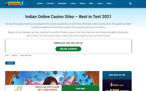
Obviously, the word “Test” shouldn’t be there. But this entire section is a big miss for me.
When you scroll down, there is a list of the best online casinos and you have 11 listed. This is a page where I would ditch the banners completely. It comes off too much like an ad farm.
What you want to do on a page like this is appear informational. Some reading of the Google Product Reviews Update is in order here.
Basically, for a page like this, you want to appear to the visitor that you know what you are talking about and that you are an excellent resource. That you aren’t just trying to make money; that you are someone directly telling them the best online casinos based on your vast knowledge, expertise, and experience.
#4: Move Content Around
A common mistake webmasters make – and this is all over this site – is trying too hard to push affiliate links via banners, etc which is what is happening here.
On this online casinos page, they DO have that information I was talking about above but you have to scroll down.
They have denoted LeoVegas as their #1 casino, and here is a screenshot showing all that:
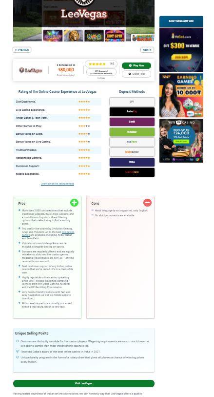
Now that is way too long – and we’ll talk about that in a second – but THIS is the type of thing that should be at the very top of this page. It’s informative, makes it look like they have put in the effort and know what they are talking about.
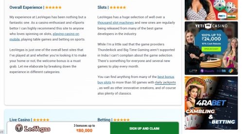
#5: Less Content, More Engaging
Think of the visitor who visits the “best online casinos” page. They don’t want a scrollbar a mile long. They want to see that the person writing the article knows what they are talking about, and has some sort of rating system to back up their grade.
This site has that but there is just too much content on this page. This LeoVegas “Review” for example could be just 25% of the size above – or even more – and be way more effective.
The overall rating system, a much shorter pros/cons list, highlighting their current promo – that’s all you need. Maybe a brief blurb about why you personally think they’re the best. Save everything else for the LeoVegas Review page. That’s where you can go nuts with content if you wish.
#6: The Review Page
So I thought I’d have a look at the aforementioned review page. I’ve scrolled down a little bit and here’s a screenshot:
So here’s one big issue for me – the LeoVegas banner at the bottom. There certainly SHOULD be a sticky-type banner on here for people to sign up as they scroll down.
BUT every other page I was on has had some random crypto casino-related banner. That’s encouraged “banner blindness” for that spot so I don’t trust that banner placement anymore. People need to consider the consistency of banners over the course of the website.
I would ditch the bottom banner. Instead, when users scroll down, have the top area minimized to something like that current LeoVegas banner. As headers and navigation bars often shrink down, it comes off more “informational” and natural.
#7: Ditch the Sidebar Banners
It’s a review page for LeoVegas, your #1 online casino. It doesn’t make sense to have three massive gambling banners advertising other properties. Plus if LeoVegas is the #1 online casino, why are these three other casinos so heavily promoted?
I said it above but make the sidebar more informational, less spammy. You can still use it to promote but why not highlight just one casino, and make it the “Casino of the Month” or “Free Spins of the Month” or whatever? That way you are still displaying an ad banner, but you’re sharing it in a more informative, and less spammy, way.
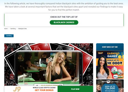
#8: Guides
They have a guide section so I thought I would look at their How To Bet Online in India page next.
I make a lot of money from guide pages so I generally know what works.
Right away I’m hit by a pop-up. Ugh. No. Stop trying to push people away. Especially new gamblers who want to learn how to bet online.
They offer a quick guide, which is good. However, it could be improved upon. The first step is “Choose a betting site”, then there is a link to “See Betting Sites”. It’s a small change – but it would make all the difference in the world. Just mention that you are going to use 10Cric as an example, as it’s “our #1 betting site and where I place most of my bets” or something like that.
It envokes immediate trust for that brand if the writer uses it.
Also, I would remove the whole “Read More” links that take you further down the page. Just a quick step-by-step guide is fine. This is just sending the navigation all over the page.
Most people don’t want to spend all this time reading. The ones that do, will find their way down the page naturally. You want to give people a quick boom boom guide, then send them on their merry way to the sportsbook that you recommend.
#9: Games Section:
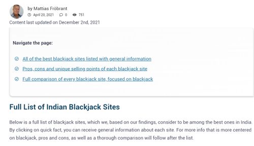
We’ve got the Games section which covers guides to various games. Let’s look at the Live Dealer Blackjack section.
It starts off great. Picture of the writer. Always like to see that. Date it was posted, then a note of when it was last updated. LOVE THIS. They are small things but they had relevancy and trust immediately. Knowing this was recently updated is very helpful. Just wish this was at the top of the page and I didn’t have to scroll down. Remove all that banner crap!
But this is where “Less is More” needs to come into play. The “Best Blackjacks Site” list has a whopping 11 sites. It should be three at most. This is just TMI.
We have that massive scrollbar again. We don’t need that. This section should also be focused purely on live dealer. If someone is coming here looking to find an online casino to play live dealer blackjack then I’ve got a newsflash for you – they don’t care about a 2% fee on deposits or withdrawals. They don’t care how easy it is to reach customer support or anything like that.
They just want to know what the best live dealer blackjack casinos are, and why. “Hey, this is the best live dealer blackjack casino because it has the most games, plus a welcome bonus purely for live dealer blackjack”. Boom – that’s all they need.
You want to have tons of SEO content in there? Sure that’s fine. But the entire above-the-fold section should be dedicated to looking informative.
Which site would you trust more at a glance?
This?
Or This?
It’s rhetorical. The answer is #2. Although ditch the whole navigate and SEO text and just get to the point right off the bat. You don’t even need fancy images or graphics. Text works very well for conversion on these type of pages.
#10: Unique Sidebar Banners:
The last one I’ll mention for now is the sidebar banners.
It’s the same three sidebar banners on every single page. I’ve already said how the sidebar should be changed – but regardless, you should be looking for custom banners for each section.
If I’m on a live dealer blackjack guide page, I don’t care too much about a banner advertising a 10,000 bonus or a 10% cash rebate.
Give me live dealer banners instead! I’m going to be more likely to click on those – banners that are relevant to me, as opposed to generic banners.
It’s what Google and Facebook do for a living and why they track everything we do: so they can serve ads directed to our exact whims and needs.
You have people on this page and you know EXACTLY what they want – casinos to play live dealer blackjack at.
Why aren’t you feeding them those sort of ads?

This article was written on December 11, 2021 however all articles are looked at on a monthly basis and updated to keep them relevant.
If you need to contact Graeme, please see his Contact Page. If you are an affiliate manager wanting promoted please see this page.


