
 Dealer Dan, pictured here with WWE Superstar Mick Foley, has been in internet marketing since 1996. He likes hugs, long walks on the beach, and making money while wearing his jammy jams. For more information, you can read all


Online bingo is one of those niches that I promoted lightly over the years, never really got too much into it, but constantly monitored it.
Back in the mid-2000s, everyone was thinking online bingo would be the next big thing. I even wrote an article about it back then, coming to the conclusion that while online bingo is not the next big thing, it is still a steady and stable online niche.
That continues to be the case. I keep in touch with quite a few affiliates who primarily promote bingo, and I’m constantly monitoring the niche. I find it quite an enjoyable niche, and when I was researching it back in the 2000s I spent a lot of time playing different online bingo games and enjoying both the fun and community aspects of it.
My friends at WDW Bingo reached out to ask for feedback on their site, and how they could improve conversions. They wanted some thoughts from an outsider’s perspective – someone not immersed in the world of bingo, so I was happy to oblige. They were also happy to have me write an article about it covering 5 key components.
So let’s talk about how to improve conversions at WDW Bingo.
#1: TMI on the Homepage
So their primary keyword, based on the title of the site, is “Best Online Bingo UK Reviews & Offers”. That’s fine But when I arrive at the site, I’m just hit with too much all at once. Here’s the above-the-fold on my 27″ monitor (which will be less for most people):
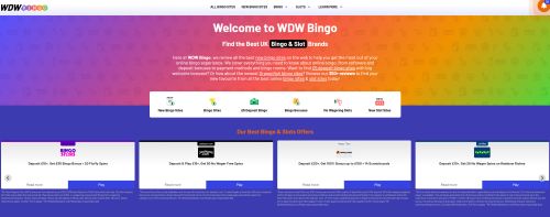
This is a LOT. We have:
– A navbar that has a notifications icon and 10 notifications on it. When you click on that, it’s a variety of links to play at various online bingo rooms.
– A welcome message which I can’t really tell if it’s for the user or the search engines. I don’t hate it, but I think if I were to do a welcome message like that I’d make it less salesy, and more informational. Get to the point a lot sooner too – plan one message that you want people to read and follow, and go with that.
– Filters such as “New Bingo Sites’, “Bingo Bonuses”.
– Then 4 blocks – with a slider – listing the best bingo and slots offers presented horizontally.
This is a LOT. If I’m on this site as a first-time visitor, I have no idea where to click. One thing I know is I feel if I just randomly click one of these widgets, I’d be getting some FOMO as it seems there is a lot more on this site, and it’s all very overwhelming.
I would ditch a lot of this. I would focus on a Top 3 list, presented vertically as people respond to that better. Have a clear #1 and reasons why, but two solid #2 backups. Maybe some pros and cons. Make it look like you’ve done the work for the user, and all they have to do is click.
You basically want the mindset of this user to be:
– “Okay I’m looking for the best online bingo sites”
– “Oh great this site has the top 3 listed with reasons as to why they are the best”
– “Well this one is only #2 due to slow withdrawals but they have more games – that’s what I want”
You’ve narrowed someone’s broad search down into 3 manageable choice CTAs and then allowed them to make their own mind up as to which one to go with, which is important.
#2: Optimize that Notifications Icon
I can’t remember seeing a notification bar on an affiliate website – or at least it is a very rare occurrence. Perhaps other sites do it but not in a manner like this where it really sticks ou. I dig it a lot, actually. A lot of online bingo players use sites such as Facebook for example, and so rely on notifications a lot. The problem is again – a bit too much TMI.
Here’s a look at it when you click on it:
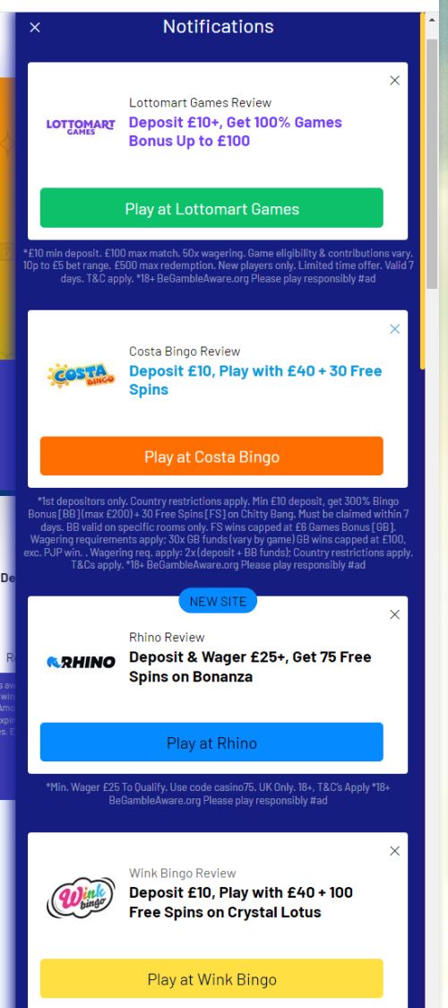
That is a LOT, and the notifications seem pointless. It’s a great concept executed poorly.
This should be used to promote either limited-time deals or new bingo halls that are offering a new bonus. For example, in December 2022 Jackpot.com was offering 25 days of Christmas Boosters. THAT is the sort of thing that should be highlighted in the notifications bar. Changing the purpose of the notifications bar to promotions like that will greatly increase conversions.
#3: Review Page Complete Revision
The next thing I would do if this was my site would be to completely revise the review pages. Here is a look at their Bumble Bingo Review Page.
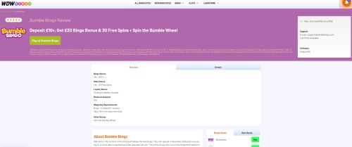
I mean what is going on here? Look at all that white space in the block at the top. There are two tabs – the displayed one which is bonuses, and then the details tab which lists payment methods, games available, etc.
This just seems like it can be presented so much better. With more colour too! If bonuses are the biggest factor for players, and with them being displayed above the fold like this I assume they are, then highlight that area better. Make it a yellow background and make it take up the whole space.
There are also no screenshots. Or video. And if you scroll down, there are no CTAs either!
So from a conversion standpoint, this is really weak and needs to be revised. I also don’t get the impression that this review was written by someone with authority on the subject. It’s not in-depth at all. Complete revision is required. Show that you have actually played at this bingo room via the written word, screenshots and videos. Show that you are experienced, and an authority to talk to people on this subject. (Not just for the people; for Google E-A-T too).
#4: Stop Promoting So Many Different Options
This is a mistake I see many websites make. They don’t understand the “less is more” concept and instead try and promote too many bingo rooms at once.
All over the site, there are a variety of bingo rooms listed. I mean just look at that 10-item notification bar for example. It’s all too much.
Cut back on that greatly. To go back to that Bumble Bingo review page for example – on the sidebar when reading the review, you have this:
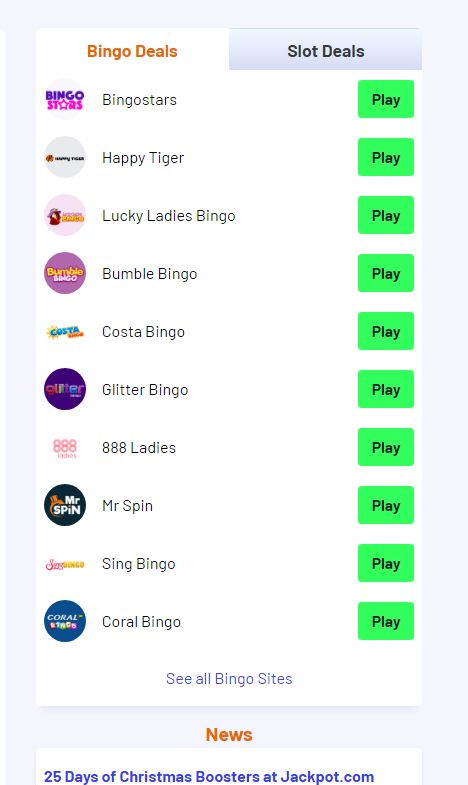
So many bingo rooms listed. Why? We’re trying to convince the reader that Bumble Bingo is a good option, so why do we have this list of other bingo rooms.
You should only be promoting other bingo rooms on this page if there is a reason to do so. Like if one of those bingo rooms offers better commission or better user retention. In which case you should focus on steering people towards it – not just providing a list of random bingo rooms for no real reason.
And that’s another thing – I complained earlier about TMI but this section has no information at all! Is ANY visitor ever going to look at this list, think “Oooh I like the name ‘Glitter Bingo'” and then click the “Play” CTA? No. If you’re going to have this section, at least highlight something that will intrigue the user.
#5: Offer a Lot More Information / Answer Questions
This goes back to reviews again – but one thing I find they are lacking is specific information about the bingo rooms.
How is the community? Do they have chat hosts? What actual bingo games do they play? That is the information that I want to know about a bingo room. Is there any best time to play when they are offering guaranteed payouts or bigger prize pools?
Also, answer common questions. Here is one example: The Bumble Bingo review says that all new depositors get a spin on the Bumble Wheel. Neat. What exactly IS the Bumble Wheel? I have no idea. The Bumble Bingo site doesn’t seem to explain it. This is where the review should be answering these questions!
This is where you can actually yank traffic from the bingo site too. Here’s a sort of hypothetical example:
– User is recommended Bumble Bingo by a friend.
– User visits Bumble Bingo directly.
– User reads about the deposit bonus, but isn’t sure what the bumble wheel is.
– User googles “what is the bumble wheel” and WDW Bingo answers that question and is #1 in Google.
– After getting the question answered, there’s a CTA stating to visit Bumble Bingo, or maybe an exclusive bonus or whatever.
– Either way, the user clicks through the affiliate link to go back to Bumble Bingo, ready to spin the Bumble Wheel.
Boom! You’ve just picked up a new player simply by answering that one question.
Also, one big factor for bingo players is rewards programs. They want to play online bingo but they love earning rewards as they play. Again this is really lacking in the reviews.
In summary, I do think there are a lot of good things WDW Bingo is doing. For example, their reviews are constantly updated and it’s refreshing to see a real person behind the reviews, and a date of August 26, 2022, when a review was last modified to know it is current. That’s something a lot of review sites seem to sleep on.
But there just doesn’t seem to be a lot of thought put into so many elements of the site. Adding a sidebar list of “Bingo Deals” without any actual thought as to what should go there, what the user would appreciate there, that sort of thing.
Spend some time thinking about “less is more”, and what the user wants or needs to see, and that should help the conversion rates on WDWBingo.
And start ranking those bingo halls! There’s a reason 99% of sites give scores and rank casinos and sportsbooks in a top x list; because it works.

This article was written on January 10, 2023 however all articles are looked at on a monthly basis and updated to keep them relevant.
If you need to contact Graeme, please see his Contact Page. If you are an affiliate manager wanting promoted please see this page.


