
 Dealer Dan, pictured here with WWE Superstar Mick Foley, has been in internet marketing since 1996. He likes hugs, long walks on the beach, and making money while wearing his jammy jams. For more information, you can read all


While I don’t do this often – I had another webmaster contact me about auditing and consulting on his website which I wanted to share here.
It was an interesting topic to consult on as it’s in an area that I am quite unfamiliar with; online lottery. I’ve never promoted online lotteries as an affiliate, and I’ve never looked into these websites as someone looking to purchase local or international lottery tickets.
The audit is complete and it was an interesting task – but I asked for permission to write a condensed version for Affiliate Bible and they allowed me to do it.
Getting Inside the Visitors Head:
This is something I always encourage webmasters to do; take a second to get inside the visitor’s head. Figure out what they are thinking, what they are looking for and present in the best way to both provide a great user experience and maximize potential income.
As this is a website dedicated to the Best Lottery SItes in India, I present myself as the visitor – someone looking to buy lottery tickets online as a resident of India. I’m exploring it for the first time, and I could likely be swayed by the likes of the US Powerball and famous other jackpots if they are in fact legal to play in India.
That’s something that I feel like many Indians would be wondering themselves. I know I’ve got no clue what the legalities are in regards to me, a Canadian, playing that.
So we’ve searched best lottery sites and now we’re on the homepage.
Homepage Analysis:
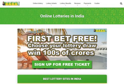
The above image is above the fold – and immediately I’m a tad concerned. I LOVE the idea of the “First Bet Free” CTA. I really do. It’s something I use on quite a few of my sites – including this one. This one is very eye-catching and takes you to a landing page that repeats the message, is cosmetically pleasing and trusting. Good stuff.
I don’t like the big green header area with “Online Lotteries in India” unless the intention is to push the rest of the content down and focus on that “First Bet Free” promo. That is taking up INVALUABLE real estate. That is something I would personally be questioning.
When I scroll down we get a nice and clean choice CTA:
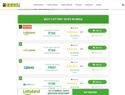
Always a fan of these. I would advise split testing if it hasn’t been done to compare vertical versus horizontal. I may highlight that “Best in India” one a little bit more too.
I’m not a big fan of the sticky footer banner ad right from the beginning. I’d rather see that pop up if I scroll down and start reading the SEO text. 6 sites are listed which also seems a tad much within this layout.
Now what I DIG is the “Quick Fact” box. I love this a lot. I feel like it should be called something else and highlighted a bit more – but this is a reinforcement and informational CTA that does the job. Look what happens when you click this:
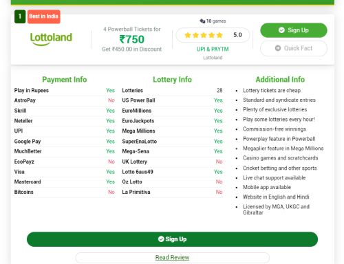
So clean and professional with excellent colour choices. Love that bullet list. This right here is a home run. This is the type of thing where I see it and immediately want to duplicate it on my own sites. Just being honest. Very, very pro.
We’ve got a big scrollbar, so I know we’re going to have a TON of SEO content. What I like is the first batch of content deals with the key questions like if the lottery is legal to play online, if it is safe to play it etc. There’s content just for the sake of it, and there’s content that benefits the user and answers key questions. This is the latter and it is great.
The majority of the rest of the content – while informational – is clearly there to bulk up the homepage. I’m always a little bit concerned about that. I feel many make the mistake of catering a site too much for the search engine as opposed to the user – and I would personally debate removing a lot of this. Depends on history, competition, etc but something to consider.
Lottery Review Page:
Analyzing organic keywords for this niche I see that specific lottery site reviews are popular. Not a surprise. They’re pushing Lottoland strongly, so let’s look at their Lottoland Review.
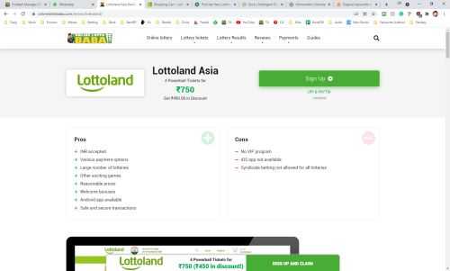
So that is the above-the-fold action. I don’t hate it but it comes off a bit plain.
One thing I would do on this site though is ditch the sticky footer banner completely. I would then have that big “Lottoland Asia” header area shrink down but stay on the page at all times. Then when the user has read more and are convinced, they can click the link to sign up.
It’s a small thing but this comes across more informational and convenient for the user which adds to the user experience. Just one of those trends that have occurred over the last few years on the internet in the form of a shrinking header which you can use to your benefit.
The entire page feels a bit generic and dull. I would consider redoing the review pages – look at review pages with sidebars on other sites and how they utilize that (I sent a few examples to the webmaster of course). There are sections within here – such as the list of Lotteries available, ticket prices and other similar lists that could go better in a sidebar.
There’s something about a sidebar and less content that can really add to that informational and trust feel.
Basically, a sidebar, less tailored content for the search engines and more for the user, and have that header shrink and follow the user down the page. Ditching the sticky banner too. These would be my suggestions.
As a user looking to be convinced by Lottoland – I found this page lacking. It was a very by the numbers review, with nothing actually convincing me that I should sign up at Lottoland. From what I understand – Lottland offers cheaper prices for buying EuroJackpot tickets for example. That’s tucked away in the datasheet here but should be listed within the Pros, and should be a top-selling point.
International Lotteries:
I’d like to think international lotteries are a curiosity factor for people in India, so let’s have a look at the US Powerball in India page to wrap up the final in-depth part of this article.
The page has the same listing on the homepage of where to buy US Powerball tickets online and it just feels like a bit much. In my head I feel like this should be an informational page – and they are trying to sell people far too hard.
Less is more, and for a page like this, I would be concentrating on just one lottery. Lottoland offers up 4 Powerball tickets for ₹750 for example – so I would probably stick to focusing on that.
There’s a lot of good information here on this page, and I think just getting rid of the big “sales” aspect at the start would be a strong move. This page doesn’t seem to have a table of contents either. I would have a table of contents as there are quite a few different topics covered and also make it expanded for easier navigation (and to encourage the user to start clicking).
Other Sections:
There are a few other sections on the site that I went into great depth about but will summarize here.
Lottery Results: It’s GREAT that they offer the lottery results for users. Very clean pages too and I think this is a smart idea. They have historical numbers which is very helpful. This is the type of resource I like to see. I feel like to assist in the informational aspect of the site the latest numbers could be showcased somewhere.
Payments: Like I’ve said above – just too salesy for my liking. Some helpful information but even consider a non-image table to list lottery sites that accept Neteller etc. Focus more on the informational aspect of these pages rather than trying to push visitors to lottery sites immediately.
I saw a site that did a table of contents in a sticky sidebar recently and I really liked that idea. For the long informational pages, that would be beneficial.
Guides: Only the one article from 3 weeks ago. Ditch the date – no one needs to see that. Fill this section up more. Get some videos going showing the process of purchasing tickets online. Have simple guides for each site etc. This is one where I would have to dive into keyword data more but I’d be looking for a lot of the low-hanging fruit here myself.
No Mailing List: I mean look we all want to hunt out those major jackpots, don’t we? Where’s the mailing list getting people to subscribe for lottery lists or just alerts on big jackpots? That’s something I would be looking at. Even allowing people to subscribe to specific lotteries for winning numbers each week. E-mail would be very beneficial and helpful to the user they are targeting.
Summary:
Overall, https://onlinelottobaba.com/ is an excellent website with a lot of great information.
The main problem is the webmaster is trying a bit too hard to push the customer to various sites. Needs to do more less is more all over the site, especially on informational pages.
It was fun seeing this site though. Very clean and nice design and I just need to repeat – I absolutely love that “Quick Fact” section. Phenomenal. That is a design I would look to implement more all over the site, to be honest. On the review page. On the Neteller page. On the Skrill page. On the Powerball page. You get the drift – it may not seem like much, but the information presented in such a beautiful fashion increases the trust factor and can be a great converter.

This article was written on November 23, 2021 however all articles are looked at on a monthly basis and updated to keep them relevant.
If you need to contact Graeme, please see his Contact Page. If you are an affiliate manager wanting promoted please see this page.


