
 Dealer Dan, pictured here with WWE Superstar Mick Foley, has been in internet marketing since 1996. He likes hugs, long walks on the beach, and making money while wearing his jammy jams. For more information, you can read all


While I don’t write too often on here anymore, I still am heavily involved in the gambling industry. I still run about 15 of my own websites and do a lot of consulting for other websites.
Consulting isn’t something I officially do – it’s more just via word of mouth, a friend of a friend, that sort of thing. I don’t do it for a living. I quite simply enjoy doing it and it helps keep me sharp. I usually do it in exchange for beers, quite honestly.
It’s something I can do on autopilot most days, but occasionally I get a request to consult on a website that is different than the norm.
One such website is ProCasino. The reason this one is different is that it’s an Italian-only website. it made it more difficult to really analyze and audit as I really like to dive into the content of a website.
Initially, I was going to pass, but then I decided it would be an interesting case study from my own perspective. While I can’t dive into the mind of an Italian gambler quite as easily, I could look at everything they are doing from a general perspective.
First impressions are everything from a website. Visitors can leave quickly. It makes it easier to gauge this website from a “quick glance” and might be helpful to new affiliates who don’t consider this sort of thing. Or experienced affiliates who have forgotten.
Here are a few things I noticed that I thought I would share – both good and bad:
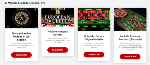
Good: Clean, Choice CTA
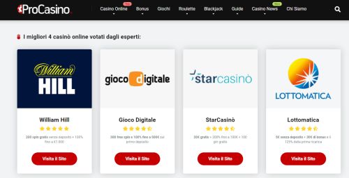
I’m always a big fan of a choice CTA. If you’re Italian and looking for a casino to play online at, you are greeted with four excellent choices right away. I like the star ratings with William Hill the only 5-star casino. It adds legitimacy and gives a strong focus to one particular choice.
The small details below each casino are also very helpful. Just the little bits of information to get a user hooked. The majority of users only care about bonuses and free spins. Highlighting that sort of thing without overloading information is the way to go.
Bad: Weak Hub Pages
First, let me say that a lot of the category/hub pages on this website are great. Above the fold they have CTAs, and they have lots of excellent content below that. However, I see two issues with the site that should be sorted.
On the page Free Spins Senza Deposito for example, at the very top is a link to William Hill, with a 200 free spins bonus. The colour choice is a bit odd:
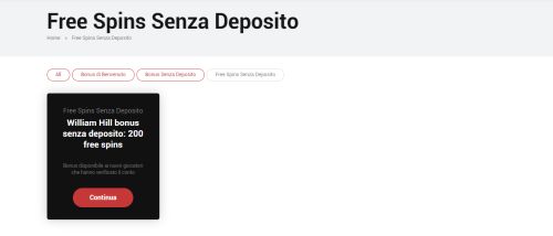
Personally, I am a big fan of consistency. The William Hill graphic that is on the homepage and shown above? I would roll with that instead. I could see trying to create something to stand out – but this comes off too “salesy” in my opinion when it should be more informative.
The second biggest issue is what happens when you scroll down: there are no CTAs. There are no call to actions in the way of banners or within the content.
This is a mistake I see a LOT of affiliates make. They focus purely on above the fold when it comes to CTAs. It’s fine to have lots of content primarily for SEO purposes but if you check with any sort of tracking tool, you will see a good percentage of the people on that page scrolling down and skimming. Sell to them!
Picture a store like Best Buy for example. What if when you entered the store, you had numerous promotions for TVs, Playstations, etc, right in your face? Then you keep walking into the store and you see general information about TVs, video game systems, computers – but no way to buy? No salesmen around. No cash registers. And sure you could walk back to the entrance – but you have a magical button you can click and immediately exit Best Buy, having gotten the information you came for. Same deal here.
At the very least, the William Hill free spins offer which is at the top of the page should follow the user down the page. This is also a prime spot to have an advertising banner at the side. Sticky sidebar banners absolutely crush it and need to be used more often. Even though this site doesn’t have a sidebar, sticky CTAs / ads are a must.
Good: Bolded Text
People love to scroll and skim through content, looking for buzz words or just to get a general idea. It’s the way the world is these days. People only read the headlines, people only read about 20% of the words on a page, etc.
That’s why the bolded text is good – to emphasize the sort of information a user is skimming for and make it a better user experience for them. Here’s an example:
And look at that – there is a STICKY SIDEBAR CTA. Get that on every page on the site STAT.
Bad: Sloppy Formatting
This may seem like a nitpick but I’ve done the testing on it. People like to see the consistent organization of a website. It sounds silly but here are two examples:
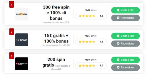
In the above image, you have the bigger text going onto two lines and three lines. Try and be consistent with that! On top of that the “200 spin gratis” one with the description text attached to it – no, no, no. I am sure that is just an oversight and a minor thing but should still be fixed.
The other is vertical boxes that don’t line up:
I see this quite often. It may not seem like a big deal but minor little things like that can turn a user off a website. It’s not a deal-breaker or anything but it’s worth going through your entire website with that nitpicking mindset and finding little things like that to fix.
It will simply enhance the user experience, and give a more professional vibe to the website which is very important; the more professional a website comes off, the more trustworthy it is to the user, and they are more likely to trust your words about a slot, casino or bonus.
Analyzing a Review Page
Finally, I wanted to analyze a review page and give some thoughts. These can be key pages plus I’ve seen enough review pages in my time, that it doesn’t matter that it’s in Italian. I’m looking at the Gioco Digitale page.
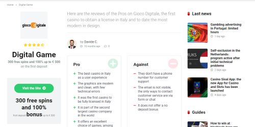
- Good: CTA right at the top of the site highlighting free spins & deposit bonus, with a nice clean button to visit Gioco.
- Bad: Date on the page saying “10 mesi ago” which is months. That indicates that the review is 10 months old, and thus out of date. Either don’t have a date at all or have a “Last Updated” date beside it. Personally, I often go with the latter and have a dynamic date from a few weeks prior.
- Good: Pros & Cons list. Don’t just be positive – present both sides. it gives trust in your opinions. If you only highlight the good things, people will ask “what’s the catch?” and have less trust.
- Bad: Comments with zero comments. Why is this right here above the fold anyway? No reason for it. It’s not even a link to the comments section. If you are going to showcase a comments section, at least have a few comments in it. Guess what? A lot of people actually trust the comments section of a page more because they feel it is more authentic. A good spot to have some comments reaffirming the positive things you have said about the online casino.
- Good: The CTA on the side follows you as you scroll down the site.
- Good: There is a right sidebar with other casinos listed as well so if they aren’t convinced by Gioco, they could go elsewhere. Personally, I would make that dynamic and not display the current casino listed.
- Bad: A couple of dated guide articles also appear when you scroll down in the right sidebar. Nothing wrong with having content within your site listed there – actually I encourage it – but try and make it relative to the user and page they are on. If I’m on a roulette article, those two spots should be saved for roulette. I shouldn’t be seeing “how to win at blackjack” on there just because it’s the latest article.
- Good: An actual rating system. One thing that bothers me is when sites give star ratings without explanation. This review goes into detail about that, gives a breakdown per category, etc. This isn’t just for the user either – the Google product reviews algorithm update pretty much requires this sort of thing.
Overall this is a very solid website. The owner has done an excellent job with the site. Most issues are minimal. The sidebar missing on some of the category pages appears to be more oversight than anything else.
A lot of what I have mentioned might sound like minor things, but you would be surprised at where these minor things can lead. that comments link on the review page for example – it’s an afterthought right now.
If that gets filled up with comments? It’s engaging for the reader. It gives them multiple perspectives. It gives them different and more perceived “honest” reviews. It shows that other users are reading the site and that it is popular, thus increasing the trust of ProCasino. All of that can lead to people clicking that all-important “Visita il Sito” button.
Thank you to the owners of procasino.it for allowing me to post this look at their website on here. I know it’s never fun to hear what you are doing wrong. Luckily they are doing almost everything right!

This article was written on October 20, 2021 however all articles are looked at on a monthly basis and updated to keep them relevant.
If you need to contact Graeme, please see his Contact Page. If you are an affiliate manager wanting promoted please see this page.


