I was contacted by the owner of BitCasinoRank.com, asking if I could do an audit of his website and I was happy to oblige.
I’ve personally never launched a website purely dedicated to cryptocurrency. I’ve been invested in it and traded with it for many years, and I was working with cryptocurrency casinos since 2014, but I’ve never run a website solely dedicated to the crypto audience.
So this was an interesting website to assess. The first thing I had to do, was to learn more about the audience. Most of the articles I have up on my websites are targeted more toward people just getting their feet wet with crypto and explaining how to get into it.
Let’s first look at the audience, and the purpose of the website:
The Audience: The audience are people who are already familiar with cryptocurrency. They probably have various amounts of different coins. They have generally embraced the world of cryptocurrency. They want to start actually using that crypto, and one of the best places for that is online casinos.
They also appreciate that deposits and withdrawals are generally very fast, and they are looking for casinos that will accept a wide variety of coins such as BTC, Lite, ETH, etc. From my research, they are also looking to jump from casino to casino, claiming the deposit bonus, doing their best to clear it, then moving on.
Bonuses are a big factor with this audience, as well as customer service and of course just general reputation. A variety of games is also a factor. A lesser deal but still important is a chat room and community feature, which a lot of bitcoin casinos have adopted these days.
The Website: What Bitcoin Casino Ranking does is it ranks online Bitcoin and Crypto casinos. Is anyone old enough to remember the “Top 50 Warez Sites” and that sort of thing that were all the rage back in the late 90s? That’s what the design reminds me of:
Some of you may look at this design and groan, but honestly, I really appreciate the simplicity of it. I remember the days of the “Top 50” site index. They were very popular, and you would find yourself opening multiple sites to compare. This is very similar, so I respect that. I know this sort of thing is actually quite popular these days, but they generally have a smaller list. I like the bigger list.
Ideally, this site should cater to the user’s needs and requirements listed above.
Let’s go page by page:
The Site Name:
I like it. “Bitcoin Casino Rank”. That’s the primary keyword. Works for me. And yeah there are other cryptocurrencies but from keyword research, “bitcoin casino” is twice as popular as “crypto casino”. So you’ve got a primary keyword of “Bitcoin Casino”, and a secondary keyword of “Crypto Casino”.
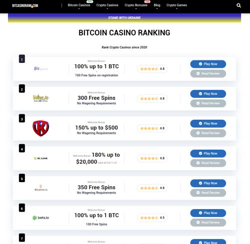
The Homepage:
The homepage is pictured above. I think overall, I have no real complaints. It lists the casinos in order. It allows you to click to check them out or read a review. it has a star rating. It also lists the bonus as the main feature which from my understanding, is the #1 thing crypto casino players are looking for.
The only thing I would do to improve it is set up some sort of voting system. I don’t know how best to implement it, but I feel like having a “website rank” and a “user rank” could be neat and add to the trust factor for the site. Perhaps just an upvote button. People like to see any sort of feedback from real users, and it helps get the user interacting with the site.
Something simple like “Have you played at this casino and if so would you recommend it?”. Maybe even allow comments on there. I don’t know I’m just spitballing here. I like it as is, just feel that could be a neat addition.
The Review Pages – BitDice:
Oh dear god, what in the heck is going on here???
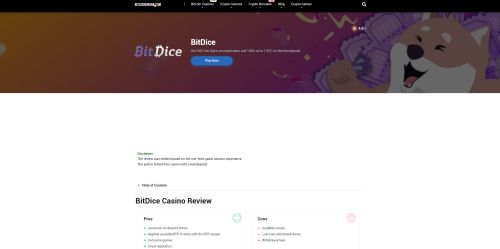
Now granted I am on a 27″ monitor, but I used my laptop and it is similar. The BitDice play now box is above the fold, and then there is this massive white space forcing me to scroll down. It makes it look like there is nothing there!
Get rid of this massive white space pronto. Focus on “above the fold” and moving the information up there.
Speaking of, let’s scroll down and look at some of that information:
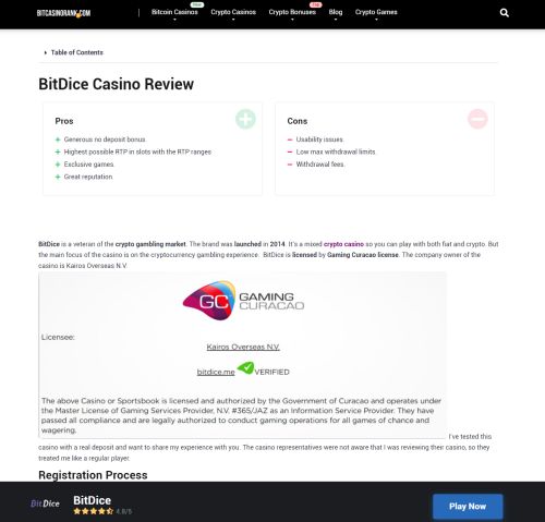
First of all – as soon as I scroll down, that bar pops up with the name of the casino, and the Play Now button. I LOVE this. It means you are providing an easy link for people if the review convinces them. You don’t have to worry about placing CTAs within the article too much. You can just focus on helpful information. Love this.
They have a section at the top called “Disclaimer”, then below it, they have two lines:
The review was written based on the one-time game session experience. The author tested this casino with a real deposit.
First – I would take away the word disclaimer. I don’t like that word. It feels negative to me. The fact that it was tested with a real deposit shouldn’t be a “disclaimer” – it should be a feature!
I would just have something simple at the top, all in one line. Something like:
This review was based on a one-time gaming session experience, where we deposited, played at the online casino, tested out customer support, and also made a withdrawal.
Something like that I like. Shows you tested everything out. Adds legitimacy to it all. And if you didn’t test all that out – then do so!
There is a table of contents at the top that you can click to expand. Personally, I feel some redesign of this area is all needed. Maybe have the table of contents open by default and on the right, and the Pros & Cons list on the left.
I would like to see a picture of the author and a name. I always feel that adds trust, especially when stating they tested the online casino out.
This sort of review is very different from most online reviews. It starts with listing the payment methods and withdrawals which is important, and it also covers the registration boxes, the withdrawal experience, chats with support – essentially a step-by-step process.
I actually used a similar process for a website back in 2008 I think it was. DansCasinoBlog.com was the name. Each week I would sign up at an online casino, claim the deposit bonus, and then blog about it for that week. I would detail the step-by-step process of registering, and then post both images and videos of the games I played.
It ended up being very popular, so it’s neat to see a similar setup.
Initially, I wasn’t a big fan of this setup on Bitcoin Casino Rank, but I must admit it’s growing on me. If I am the target market, I am digging this.
I feel it could be presented slightly better design-wise. Basically, sit down, and try and figure out how the hell to get that scrollbar a bit shorter.
There are also a lot of chat boxes that I feel are unnecessary. An image that is 704 in height just detailing the chat rep telling the user that mascot slots are only available with the bonus balance? I don’t feel that is necessary. Too much valuable real estate is being used for those, even though it does show the user actually deposited.
If you must use them, just reference them and link to them instead and use a lightbox or whatever the kids use these days to display images within a website.
The Review Pages – No Consistency
So after looking at the BitDice review, I clicked on #2 on the list which is Winz.io. Here’s what it looks like:
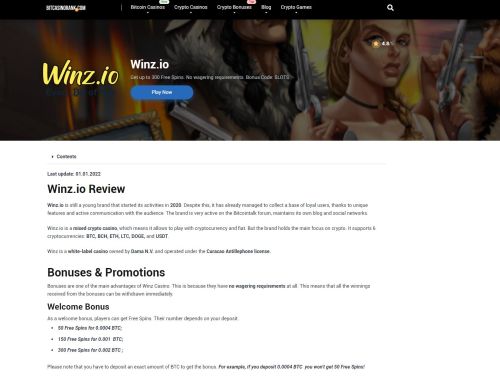
No huge white space which is nice, but where did the big pros & cons box go? This is also a more informative review which is nice – but isn’t consistent with the previous review.
Then I click the #3 casino and this is all I am presented with:
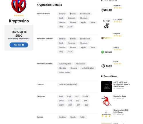
No view at all. Just deposit and withdrawal methods.
Reviews are their main content The game pages don’t seem to be finished yet. And it’s shocking that this casino is ranked 3rd yet has no review. So I feel I have seen enough. Let’s summarize this:
Summary:
The first thing I would do if I bought this website tomorrow, is focusing on the review pages.
I would come up with some sort of consistency across the board.
I feel like I would focus more on the authoritative, informative review that you see from the Winz.io review. I might even look at adding the table of contents to that floating bar at the bottom for easier access for people to navigate.
I DO love the BitDice bloggy aspect to it though. So what I would do is start using the “Blog” section more on the website. No surprise that the Blog section is filled with content primarily for SEO. That’s fine. But I would start using that to blog my actual experiences at the casino instead.
Practically everything in the BitDice review could be used there.
So I would clean up the reviews, make them similar to the Winz.io review just with a fair bit of tightening of the design, with a strong focus on easier UX via the navigation, and make the scrollbar smaller.
Then I would have a blog for every individual casino where I can go into all of the detail that is seen on BitDice. This is very encouraging to users, and I would link that at the top of the review where the “Disclaimer” is to let people see the process. It also encourages navigation within the site which is never a bad thing.
That would be my primary focus, to begin with. Focus on those reviews. For a lot of bitcoin casinos these days, people are hearing via word of mouth. Lots of communities where people are asking what casinos to play at, and then obviously searching for reviews of those casinos.
Ranking won’t be easy as I checked quite a few of them and there is some good competition out there. But I feel the blog aspect will help things.
You could even include the blog on the review page to increase word count, but if that was the case I would have it hidden and the user has to click to expand it instead. I don’t want a ridiculous scroll bar.
I also think I would try and list 50 casinos (if there are that many) on the homepage. Maybe 20 or 30. Right now it is 12. I like the idea of people scrolling down, looking at this huge variety, and looking for any hidden gems. You can also use this for testing by promoting different features such as the community, and seeing how many people click it, etc.
Overall, the site shows a lot of promise. With “ranking” being the main keyword, there needs to be some thought put into the entire ranking system and allowing users to rank the casinos, and then a strong focus on consistent but tidy reviews.

 Dealer Dan, pictured here with WWE Superstar Mick Foley, has been in internet marketing since 1996. He likes hugs, long walks on the beach, and making money while wearing his jammy jams. For more information, you can read all


