 Dealer Dan, pictured here with WWE Superstar Mick Foley, has been in internet marketing since 1996. He likes hugs, long walks on the beach, and making money while wearing his jammy jams. For more information, you can read all


Alex had e-mailed me requesting a public audit of his website CasinoAffPrograms.com.
Like all websites, I browsed it first of all before replying. I found quite a lot of issues with it, to be honest.
I try not to be negative when it comes to reviewing websites, but rather give constructive criticism. Especially this website where I could tell a lot of effort had gone into it.
So I’ve decided to look at it from the perspective that I’ve just bought the website. So I now own the website. Here are 10 things, in no set order, that I would immediately change upon purchase of the website:
#1: A Consistent Design
One thing that immediately bothered me about this website is the design didn’t seem consistent. Entire sections of the website seem like a completely new website.
That’s a bad thing. People aren’t expecting big changes when browsing a website. When you incorporate big design changes, you lose the visitor’s confidence and make them think they have visited another website.
For example look at the design change from this casino listing to when I click on one of the logos to read a review of the casino:
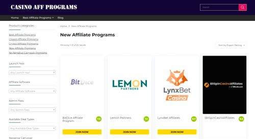
The entire background changed and everything. They look like two completely separate websites. That’s not good. Get a consistent design going.
#2: Eliminate All This Wasted Space
“Above the fold” is the most important part of a website. It’s the top area. What people see first. You need something enticing to keep people reading.
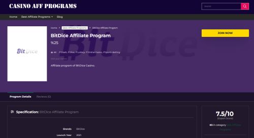
Let’s look again at that BitDice Affiliate Program review:
I’m getting a headache just looking at all that valuable real estate going to pop.
Some insanely big logo which is mostly white space for no reason. Hashtags. JUST! SO! MUCH! SPACE!
To see ANYTHING interesting I have to scroll down. I should not HAVE to scroll down. I should scroll down because I WANT to. Because something here has hooked me and I want to read more.
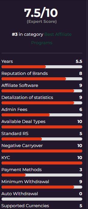
The sidebar actually has the sort of content that would make me want to scroll down. It has an expert score, and then ratings of various categories:
At the very, very least, this should be at the top of the page. It’s the type of graphic that people can glance at and get hooked, and keep reading more.
#3: Where the Hell is the Content?
So we have that sidebar with those scores. I would expect to be able to read more data on all of that, and specific reasoning for the scores. Instead we get this:
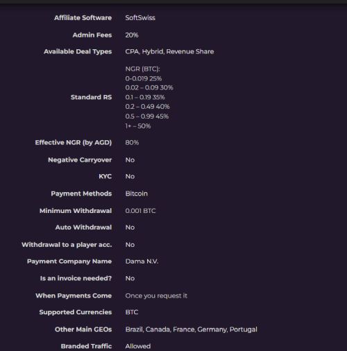
It’s just another big list. If anything, this list actually is more informative and could replace the sidebar. But we don’t need two lists.
Content is King. One of the first things I would do is replace this list with actual factual information with lots of words, writing everything down.
I would also be explaining what some of this means. I’ve no idea what “backlink” means for example. There are also details that I’d like to see that aren’t there, such as permitted countries.
If you’re going to be providing reviews of anything, you should be providing everything the reader would need to know. You should also sound like you know what you are talking about. A fact sheet and a random scoring system just don’t cut it.
I’ve said time and time again on here one of the most important things you can do is get inside the visitors’ head.
Start thinking about the visitor who has googled for BitDice Affiliate Program and found this page.
Have you given them everything they need to know? No. You have not. I want to know what countries are accepted. I want to hear this person’s actually history with working with this program.
I would be building up very detailed and comprehensive reviews. Also, I’d probably ditch the whole “user reviews” deal unless I intend to fill it with false information myself. No one is really reaching out to review affiliate programs, and if they are they are going to be negative about it. It just makes the site look like a ghost town, and is more wasted space.
#4: SEO Primary Keyword
So the domain name is CasinoAffPrograms.com but that isn’t a term someone is searching for. Yet it’s all over the website.
I would be SEOing for Casino Affiliate Programs. That is a term people are searching for. People are looking for casino affiliate programs so why wouldn’t you have that in your title? In your copy? All over the site?
That’s the target market and the domain is close enough that you can just rebrand the site as that, no problem.
#5: Now Think About THAT Visitor
This is the problem with so many sites and it makes me shake my head in frustration. People don’t seem to ever sit down and think about the new visitor who is visiting, and their perspective of things.
Let’s picture Joe. Joe is wanting to get in the affiliate game. Joe wants to start working with casino affiliate programs. Joe googles “Casino Affiliate Programs” and comes across Casinoaffprograms.com. What is he greeted with?
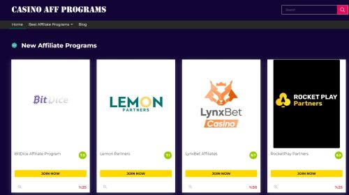
Ugh.
4 random affiliate programs take up all the screen space. None of them are that highly rated. Zero information about them. No links to a review or more details about them. Yes, you can click the logo but most people won’t know that.
Three of the programs have a % listed at the bottom right and one doesn’t? This just all comes off so half-assed. And need I mention the size of these freaking logos again?
Plus why are the NEW affiliate programs getting the top spots? What does NEW even mean? Newly added? Or are new programs just open? Because if it’s the latter man sorry I have no interest. I want to work with reputable programs, not some crypto casino that’s popped up overnight.
This entire thing just doesn’t seem well thought out at all. It’s all slapped in there. No thought about what the visitor is doing. What they are looking for. How they can navigate the site. How we can make it EASIER for the visitor.
That should always be the goal: give the user the BEST user experience possible.
#6: Do This Little Thing Called SEO
The majority of the traffic for this site ideally will come from people looking up general reviews, or people looking for specific reviews of an affiliate program.
The problem is that SEO is non-existent. Pick any affiliate program review. The keyword should be “Income88 Affiliates Review” or similar. The Income88 brand name is mentioned once in the title, once in the breadcrumbs, then once in the specs. That’s it. There is just zero SEO and this site is going to get zero traffic from google.
Let’s Cut to the Chase
Here’s what I’d really do. I’d scrap this website, and start fresh.
Unfortunately, not every audit has a few easy solutions to better optimize your website. This is one where I would start fresh. New design. Thinking of the user. Content-rich affiliate program reviews basically.
Here’s a quick guide to Alex as to what to do:
Get a New, Consistent Design. Something simple but professional. Clean but classy. Something authoritative for all over the website.
Get Inside the Users Head. Really sit down and think about your audience and what they’re looking for, then deliver it to them in the most user-friendly way.
Give Them What They Want Immediately. There’s too much-wasted space and scrolling down and massive logos on here. Not one person needs to see a 500×700 image for the logo, where 80% of it is just a black background. That makes zero sense!
Use Your Homepage and Hub Pages for Summaries: Sometimes, all people want is a quick pros or cons list and a few details. Look at Covers.com for example:
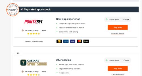
THIS is what should be on there, instead of big logos, a random percent amount, and no clear links to reviews. It’s summaries of online sportsbooks. It has their rating, a few pros of them, a note about their payout speed, and deposit and withdrawal methods.
All of that is very helpful information. If that is all I was looking for, then I would click “Play Now”. If I needed more or it piqued my interest, I’d click on the review. Where guess what? It breaks down the entire sportsbook with about 1000 words of lovely content optimized for search engines.
The most important thing is to learn from your mistakes. Take a step back and look at your website from the visitors’ perspective. Get inside the head of the visitor by googling for “Casino Affiliate Programs”, or “Bitdice Affiliate Program”. Look at your website and you’ll realize that it just isn’t a helpful resource for that visitor at all.
You’re not going to convert them to a sub-affiliate because you haven’t done enough to satisfy their query. They’re going to move on to other websites.
All of this is okay though. No one hits a home run from the beginning. It’s all about learning from those mistakes.
This is a solid domain.
You just now need to build a solid, resourceful website to match it.

This article was written on July 12, 2022 however all articles are looked at on a monthly basis and updated to keep them relevant.
If you need to contact Graeme, please see his Contact Page. If you are an affiliate manager wanting promoted please see this page.


