One thing that’s great about being a marketer is you never actually have to go out of the house to do any research – every week your work and research is delivered to your house. It’s delivered in the form of junk mail, store flyers, newspaper advertisements etc.
While the snail mail medium is a whole different ballgame than online, there’s still a lot we can learn from this type of medium. The conversion ratio is usually a lot lower, as they’re hitting a very broad demographic. What this usually means is that the ad company has to work a LOT harder to make a profitable ad campaign.
To put it in online terms – imagine running a Google Adwords campaign. However you only get to break it down by location, not keyword or any particular demographics. Even worse – you have to pay per impression, not by click.
These are the challenges a lot of these ad companies face. They don’t have the ability to split test. They can’t write off an unsuccessful campaign as a “learning experience”. They have to hit a home run out of the park every time.
While perusing the junk mail this week(FYI: the politically correct term is “Advertising Mail” – the more you know!), there was one flyer that really stuck out for me. It was for the company Shaku Family Martial Arts. As I examined the ad copy I was even more impressed, to the point that I knew I had to come here and write a detailed analysis of it.
I will note that it’s not all positive – but I’d give it a rating of 8/10 which is very good. Any negatives within the ad, or anything I feel they are lacking I will also mention.
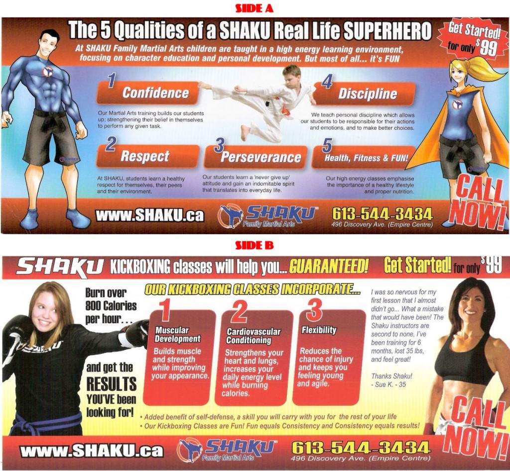
So first off, here’s the double-sided flyer – click to see full-size and I recommend you spend a few minutes just staring at it, composing your own thoughts, and taking everything in:
Now we’ll analyze both sides of it. Before I do that however, I just want to comment on the overall look of it. It’s very professional, and doesn’t look cheap in any way. It also has a nice card feel to it – doesn’t feel flimsy at all. This really matters, as it stands out from the crowd and looks like money went into it.
People will subconsciously treat something like this with more value, and give it a look before throwing it out, compared to some black text on white paper flyer. If you want to test this theory, watch someone after an affiliate conference when they’re going through the 300 business cards or flyers they picked up. Watch and you’ll see them toss aside the cheap ones, but always take a few seconds to examine the more professional cards. And if you have the right ad copy, a few seconds is all you need to get your hooks in.
Alright, let’s go through this flyer side by side(as in – each side of the flyer, not us sitting together all cozy!) and examine all the elements on here:
Side A: Positives:
Double Sided: Before we go any further, I want to applaud them for utilizing both sides of the flyer, with different marketing techniques on both sides. Many flyers won’t do that – instead having a “front”, then the back reserved purely for information like address, mini-map – all of which is mainly useless(because if people are interested in it, they’re not idiots – they’ll find out where it’s located).
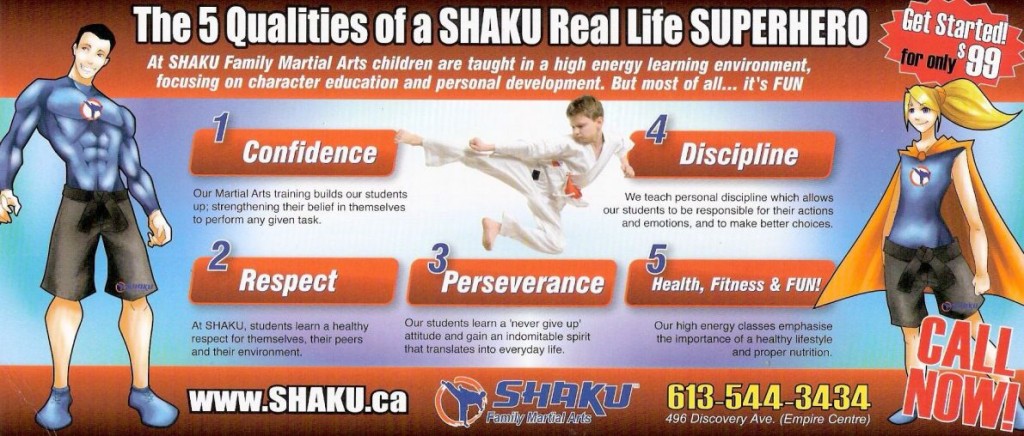
Appeals to All People: The 3 things that stand out the most on this side of the flyer are the images. We have a picture of a child, who is exuding confidence as he flies through the air. We then have cartoon graphics showing a fit man and woman(both with a Shaku logo on them – nice little branding touch). Right off the bat, they’re trying to say “this is for everyone”.
Vague Description of Price: It’s important to put the price on these flyers, but without going into too much detail. Vague always works out better – just look at how online casinos promote bonuses. It’s eye-catching, and looks affordable. It also gives people an incentive to pick up the phone or visit the website to find out more information(and by then, they’re hooked). You want people curious, and wanting more information. “Get Started for only $99”. Hmmm, well how much is it regularly? How many classes does $99 cover? (From a business perspective I don’t dig this – I’ll mention this in the negatives section).
The 5 Steps: The 5 steps section here are fantastic – they’re like the online version of bullet points. Each step is a call to action – you can read the 5 step titles, and fully understand what they’re all about. Even more importantly, it relates to the reader. I mean really, who doesn’t need confidence? Or to gain better discipline? Or to persevere more? Or hell, just have fun while getting healthy? The bullet points/5 steps are important because the reader can look at that, and relate to them.
Even more importantly – the lines underneath each step, basically reaffirming the steps, or explaining them in more detail. See – here’s one of the biggest problems with most flyers – they’ll throw out all these buzz words, without any depth to them at all. This one doesn’t do it – it breaks it down. I mean hell I’m a parent – I’m worried my kids will make the wrong choices later in life(like do drugs or promote BWin). So I read under discipline “We teach personal discipline which allows our students to be responsible for their actions and emotions, and to make better choices.” and I LOVE that – because now it gets me thinking “Hey, maybe if I sign my kids up for this then it’ll help them make better choices in the future.”
Footer: The footer contains the brand name and logo which is good, and also contains all the relevant contact information. The address in small print is perfect, and listing the website and phone number nice and clear is all that is needed. It’s great that they offer both too – some people don’t have internet access while others just don’t like talking on the phone so they cover both groups. Also no silly “check out our Facebook group” nonsense that has plagued so many ad campaigns as of late.
Side A: Negatives
Lack of Information: A big one for me is that they don’t break it down as to what this actually is. It’s “Family Martial Arts” – but what does that actually mean? Does it mean I can go in with my kids? Does it mean they have classes for adults and children alike? And if so – can my kids go in and do karate while I do BJJ or whatever, all at the same time? I think this was a bit too vague, and they could’ve really laid it out better. The header area would have been perfect for that, where that “superhero” nonsense is. Speaking of:
“Superhero” Nonsense: I just don’t like this. It gives off a real out-of-touch marketing vibe to it. Who are they selling to? The only thing I can think of is that they think kids are going to look at it, and see the “superheroes” and be all “Oh daddy can I be a superhero like these guys?”. I just think this really missed the mark, and wasted some valuable real estate. In saying that, I do think that the two “superhero” graphics help make it stick out, and look different. It’s more the whole theme and text that turns me off.
No Free Trial: This is more from a business perspective than a marketing perspective but I wanted to mention it. Martial Arts is the hot thing these days, and more and more parents will be thinking about getting their kids into it. However I really think they’re missing out by not marketing a free trial as opposed to the $99 deal. Both my kids are already in a dojo, and the whole reason we went to that particular dojo was because they offered a free trial.
On top of that, they also are very relaxed in terms of participation. We pay money for the kids to do 15 classes, but they don’t have to go “every Saturday” or whatever. They can just go whenever they want. If they do 4 classes in a row then miss the next 6 weeks that’s fine – there’s still 1 classes for them to do at anytime. So from a business perspective, I think they’ve missed the mark. They would get a much better ROI if advertising a free trial in my opinion. It’s funny because they actually offer a 30 day trial…so why they wouldn’t advertise that is beyond me.
Okay, onto Side B:
Side B: Positives
Consistency: The structure and layout of both sides is the same. This is good, because people don’t get confused; they know Side B is basically a continuation of Side A. In addition they changed the background colour which makes both sides look different and stand out from each other, so anyone glancing know that each side is “different content but same company”.
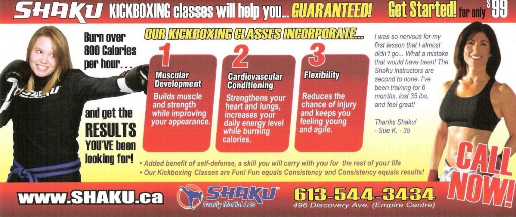
Focusing on a Specific Demographic: Side A was great in that it covered a broad demographic of kids and family, so side B focuses on a specific niche and demographic, which is kickboxing for women. Great personalization.
Real People: I think when appealing to guys, you can often get away with the bodybuilder type guy in marketing, because we men are always delusional, and think that a few situps can have us looking like Fabio! Women are different, and they’ve used real people for the women to relate to, as opposed to supermodels. Hell, the girl on the left I believe even has a zit or two on her chin! Real people work so well here.
The Benefits and Buzz Words: We have three main benefits listed again in a bullet list format, which I covered previously. It’s a different design from the other bullet list though which I really like. People aren’t going to gloss over it. There’s also additional buzz words and phrases like “Guaranteed!” and of course the big one – “Burn over 800 Calories per hour”. Who wouldn’t want to do that? And they can do it in a fun way too! Money.
Testimonial: Testimonials are usually always beneficial. This is a great one too because look at the first line – “I was so nervous for my first lesson that I almost didn’t go…”. There are so many women out there that would LOVE to do something like this but are nervous. This one hits them HARD. It then goes on to state that she lost 35lbs in 6 months, and you know so many people reading that are thinking “Wow I would KILL to do that”.
Side B: Negatives
You know…there really aren’t any. It’s great and to the point, and really covers everything.
Overall Thoughts:
I’ve covered pretty much everything I can above. I’d also like to mention that they didn’t go into informational overload, or try and cover too many bases. So many of these companies try to cover every target market(ie: people like me whose kids are already in a dojo) but they didn’t do that. They had an aim, and stuck to that focus.
Finally, the one thing I didn’t mention too much about that I want to is the branding. Lets count how many times “Shaku” is mentioned:
Side A:
- Title
- Subtitle Text
- In the “Respect” subtext
- Website URL in footer
- Logo and Company Name in Footer
- Logo on male superhero
- Logo on female superhero
Side B:
- Title
- On girls top
- In testimonial
- In testimonial again
- Website URL
- Logo and Company Name in Footer
That’s 13 times which is huge. Why are they doing this? It’s simple. What they are doing is wanting you to think “Shaku” when you think “Martial Arts”.
And with Martial Arts being so popular these days, the next time two moms in that area have a conversation and talk about signing their kids up for martial arts, their hope is that this triggers the subconscious to state “I heard of some place called Shaku”.
This “advertising mail” gets a big thumbs up from me, and props to the marketing company for really nailing it. This is one piece of “junk mail” which really doesn’t deserve that label.
What did you think of the flyer? Leave your thoughts in the comments. And if you have any flyers you want me to analyze, upload high quality scans and then send an e-mail to dan@dealerdan.com.

 Dealer Dan, pictured here with WWE Superstar Mick Foley, has been in internet marketing since 1996. He likes hugs, long walks on the beach, and making money while wearing his jammy jams. For more information, you can read all


